As homeowners, we are all familiar with the walls found in our homes. Here, they are almost always solid partitions that isolate and divide the spaces of the house into distinct rooms with specific purposes. Walls also perform a similar function in the landscape, with designers utilizing plants, fences, and other elements to separate our outdoor living spaces into functional rooms.

One of the promises we’ve made is to reveal to you some of the finer tricks and techniques of the master landscape architects and designers so that you can leverage them to realize the full potential of your landscape. One of the more common and yet the least apparent of these tricks is the intentional use of virtual walls.
What exactly is a “virtual wall“? The best way to define virtual walls is by juxtaposing them against the solid walls with which we are most familiar, whether they be the walls within our homes or outdoor walls like fences or tall hedges.
These are generally opaque, with no openings or “porosity“, save for intentional features such as windows and doors in the home context, or a gate in the context of a fence. They are typically taller than human beings, completely obstructing the view from one room to the next except as allowed by windows. And, they are impermeable and obstructive, forming a physically impenetrable barrier between the spaces which they separate.

Virtual walls violate one or more of these parameters. They have some degree of porosity (the ability to “see through” them) which may range from as little as 10% in the case of a picket fence, to over 90% in the case of a series of upright plants intended as a visual distraction.
They are not restricted in height and can range from as low as 1′ for a small stone edging or a micro-hedge, to over 50′ tall in the example of a row of narrowly columnar trees. And, they are certainly not impermeable; short walls can often be stepped over, and porous walls can be walked through.
These are the reasons why we refer to them as “virtual” because they aren’t really walls as we tend to understand them. And yet, they are almost equally as functional as their solid cousins, and in fact, are more effective in certain applications. So how can this be?
The Potent Magic of Illusion
Virtual walls take advantage of a couple of our human characteristics to create the illusion of a barrier, when truly it may not be a barrier at all. Better landscape designs take advantage of these illusions to simulate walls without the obtrusive or oppressive habits of solid walls.
The first illusion is a sleight of hand with respect to our eyes. You see, when first confronted with a scene, our eyes will latch on to dominant elements in the foreground in preference to distant objects in the background.
In the case of a solid wall, this is rather obvious, because we can’t actually see what’s behind it. But something as simple as a couple of trees or shrubs in the foreground is enough to catch our eye and thus dominate the scene to the detriment of anything behind, even if the entire background is entirely visible.
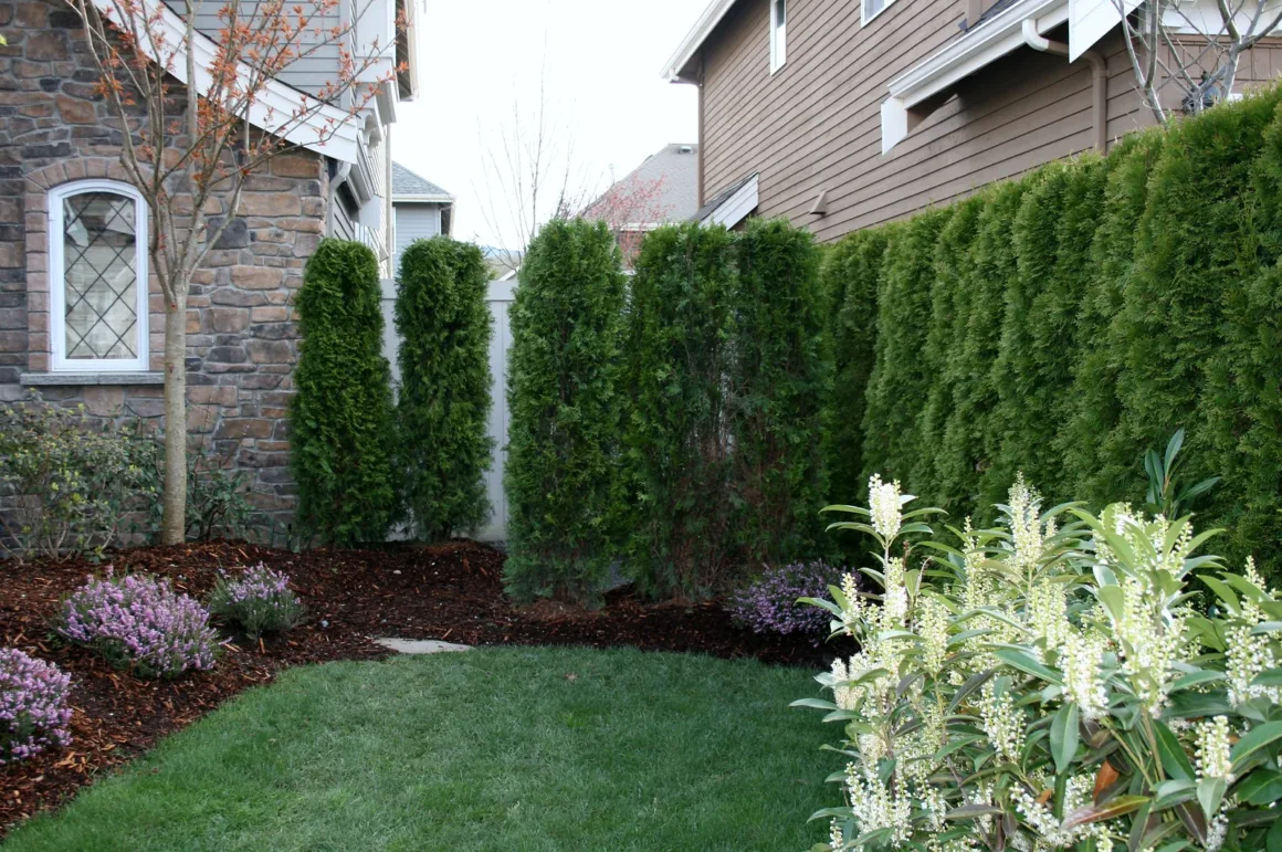
And if these foreground specimens are arranged in a row or some other recognizably linear pattern, we’ll actually perceive them as a wall! We may be able to see the highway or another house or even an ugly factory belching smoke behind them, but our eyes will immediately lock onto this perceived wall, and it will take some time before we actually register that there’s a scene behind them.
Generally speaking, the less porosity or gap between the foreground elements, the longer it will take us to register what’s behind them. In fact, at only 50% porosity, it may take us minutes to notice that there’s actually something behind the “wall“.
If we’re only looking in passing, for example walking or driving by, that may not be enough time for us to register this at all – for all we can recall just moments later, all we saw was a wall!

The second illusion that gives power to virtual walls is the tendency for us humans to seek out and interpret anything that delineates a space, particularly if it subdivides it into “human” proportions (for example, the kind of proportions we find in the rooms of our houses).
We tend to find large open spaces slightly disturbing (the extreme example of this is “agoraphobia“, an irrational fear of open spaces), and actively seek ways to bring them down to manageable sizes.
Likewise, we find excessively small spaces somewhat confusing and unnerving, and we seek larger assemblages of them. We will interpret anything that serves these purposes as a wall, and respect the subdivisions it portends.
Surprisingly, height is not necessarily a constraint, as we might imagine it to be. Obviously, any collection of elements, be they virtual or solid, that is taller than the average human scale, say around 5-6′ or taller, will easily be perceived as a wall.
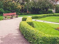
But we will even perceive a 1′ tall by 1′ wide bushy green hedge as a wall, a physical barrier demarcating a space, especially if that space is relative to human proportions. People actually have an inherent reluctance to step over a 1′ tall hedge, even though it poses almost no physical impediment at all!
Read Also:
Designing With Virtual Walls
As you can clearly see, solid walls aren’t the only way for us to divide the spaces in our landscapes.
Yet too many homeowners and home landscapers default to the use of continuous fences, impenetrable hedges, and other solid barriers; the result is the creation of an oppressive “fortress” around the property, which sends a message to the rest of the world that the property is uninviting and that the homeowner is cold.
Astute designers are aware of this, and that’s why they frequently utilize the technique of virtual walls to deliver the function of a wall without the associated obtrusiveness of a solid structure.

Virtual walls can be used in almost any application that calls for a wall. The key to employing a virtual wall in a landscape context is to understand the requirements of the application and to define the minimum porosity and the minimum height that will serve that purpose.
The most common application is the delineation and demarcation of outdoor living spaces into functional rooms. In some of these applications, a degree of physical screening is important, and the porosity and height must be selected accordingly.
If the purpose of the wall is to isolate an entertaining space from a utility space, for example, to separate an outdoor BBQ area from the gas meter and clothesline, then the design would call for low porosity and a height of 5′ or more.
On the other hand, if the wall was needed to isolate the kids’ play area from the veggie garden, a low 2′ hedge would be more than adequate to convey the message to the kids!
This brings us to the important landscape function of screening. Often times a wall will be used to block the view to an undesirable scene behind; an industrial area, a busy thoroughfare, or a middle-aged neighbor who likes to sunbathe in the buff.
Generally speaking, the more offensive the view, the taller and denser the wall needs to be. But only go as far as you need to; a row of widely spaced shrubs with 50% porosity will almost completely block the view to the street from the property.
Other times we’re using a wall to contain a space that may not necessarily be backed by an offensive view. For example, a property overlooking a lake or a farmer’s field, or a hillside view might actually have an attractive vista, but the space feels too open and unsettling. Here, a few strategically placed trees might be all that’s required to contain the space while retaining the advantages of the favorable view.

Finally, virtual walls can be used to guide people around the yard and to indicate what’s in bounds and what’s out of bounds. Often a 1′ hedge is enough to tell people to stay off the grass or out of the gardens, while still affording a complete view of their majesty.
Some of the finest Victorian gardens use the smallest boxwood hedges imaginable to keep guests out of the gardens and to guide them around the displays. People intuitively understand the message conveyed by these walls, even if there is no physical impediment to passage whatsoever.
Here are some basic rules of thumb when planning for virtual walls. The height of the wall should be determined by the offensiveness of the view behind (more offensive means a taller wall), the total length of the wall (longer walls require taller elements), and the scale of the room being demarcated.
The porosity of the wall should be as open as the application will permit, based on the relative attractiveness of the view behind it and the degree of impermeability required (denser walls send the message “keep out!“).
But there are places where virtual walls simply won’t cut it. For one thing, they don’t really offer any true security and don’t make good physical barriers. If you’re trying to keep out burglars or force the persistent paperboy to use the sidewalk, you’ll probably require a solid impermeable wall. And porosity is directly related to sound; you’ll probably require a solid and dense wall if you’re trying to block offensive street noise.
Implementations and Solutions

There are a number of ways to implement virtual walls in the landscape, depending on whether they are developed using plants or hardscaping materials. Plants are the easiest to work with and are the most aesthetically pleasing in the context of a landscape composition.
They come in a wondrous assortment of shapes, sizes, colors, and forms, and are particularly effective for developing high-porosity screens and visual distractions.
However, keep in mind that plants are dynamic elements that grow and change over time. At the start, a grouping of lilacs spaced 10′ apart will only be perhaps 2′ tall and have over 95% porosity. Only five years later, they will be over 8′ tall with a porosity of less than 40%.
In general, plants are cheaper and easier to “install“, and afford a more natural look to the virtual wall, but they are harder to nail to a specific target height and porosity and are definitely higher maintenance than hard elements.
Hard elements, on the other hand, offer quite a range of options from which the designer can choose. There are so many choices for materials; wood, metal, stone, and brick are but a few. These can be crafted into all ranges of heights and shapes, and even combined to produce varying degrees of porosity.

The most common technique for developing hardscaping walls is the ubiquitous fence. But we are talking virtual walls, so the challenge for the designer is to abandon the standing perception of a fence as being a solid wall and to begin to think of creative implementations and structures that are more “suggestive” of fences.
A fence can be a low collection of natural stones bound together by masonry cement, a series of stone pillars supporting horizontal wood or metal bars, a low picket fence, or a wrought iron barrier that allows total visibility behind.
Generally speaking, hardscaped virtual walls are relatively complicated to install and often represent quite an expensive investment in the landscape. However, they are far more constant than plants, more enduring, typically require less maintenance (but never zero maintenance!), and they are much easier to make totally impenetrable while maintaining a high porosity (think iron fences).
With all these options at your disposal, you can easily find a virtual wall solution that’s right for your situation, while being distinctive and expressive enough for your personal landscape. Just remember; to try to go as low as possible and as porous as the application will allow. The more your solution can deviate from the ubiquitous solid wall, the more you’ll be applying this wonderful design technique to advantage your landscape!


